
The Before and After of Oceans
The Oceans digital boardgame was developed by an outside house and the publisher felt it was struggling with its UI as well as visual design and feel. I was brought in to bring the app’s art direction and UI more in line with what we were looking for: modern, fresh and intuitive interface set in an immersive play space where the user felt a connection to the ocean.
Playspace Redesign
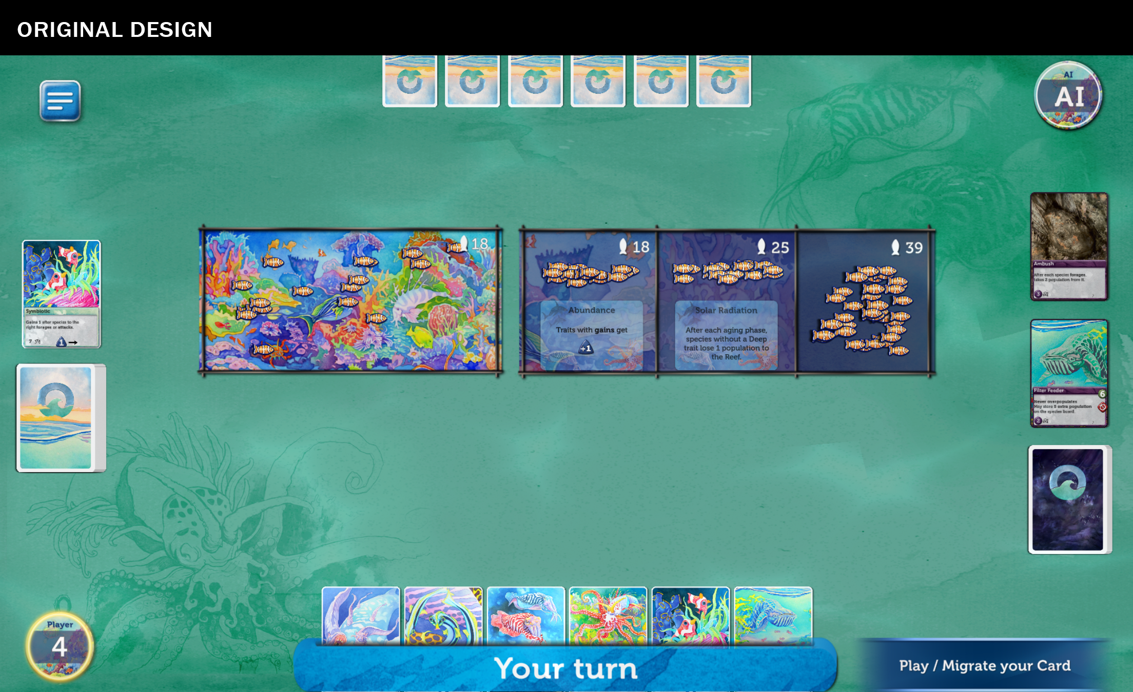
Above is the original design and the redesign of the art direction, as well as an update to the UI. Feedback for the artist centered around these issues:
Low contrast made the elements difficult to pick out on a mobile device.
Teal green background with sketchy art felt flat, non-immersive, and more like a shallow lagoon than ocean depths.
Skeumorphic reef boxes in the center were consistent with the cardboard game components but didn’t translate well to digital.
“your turn” is given far too much prominence on the status bar, whereas the important user action “play/migrate your card” is actually the most important call to action.
Menu Button, Card Pocket, Player / Points markers felt very outdated, aesthetically.
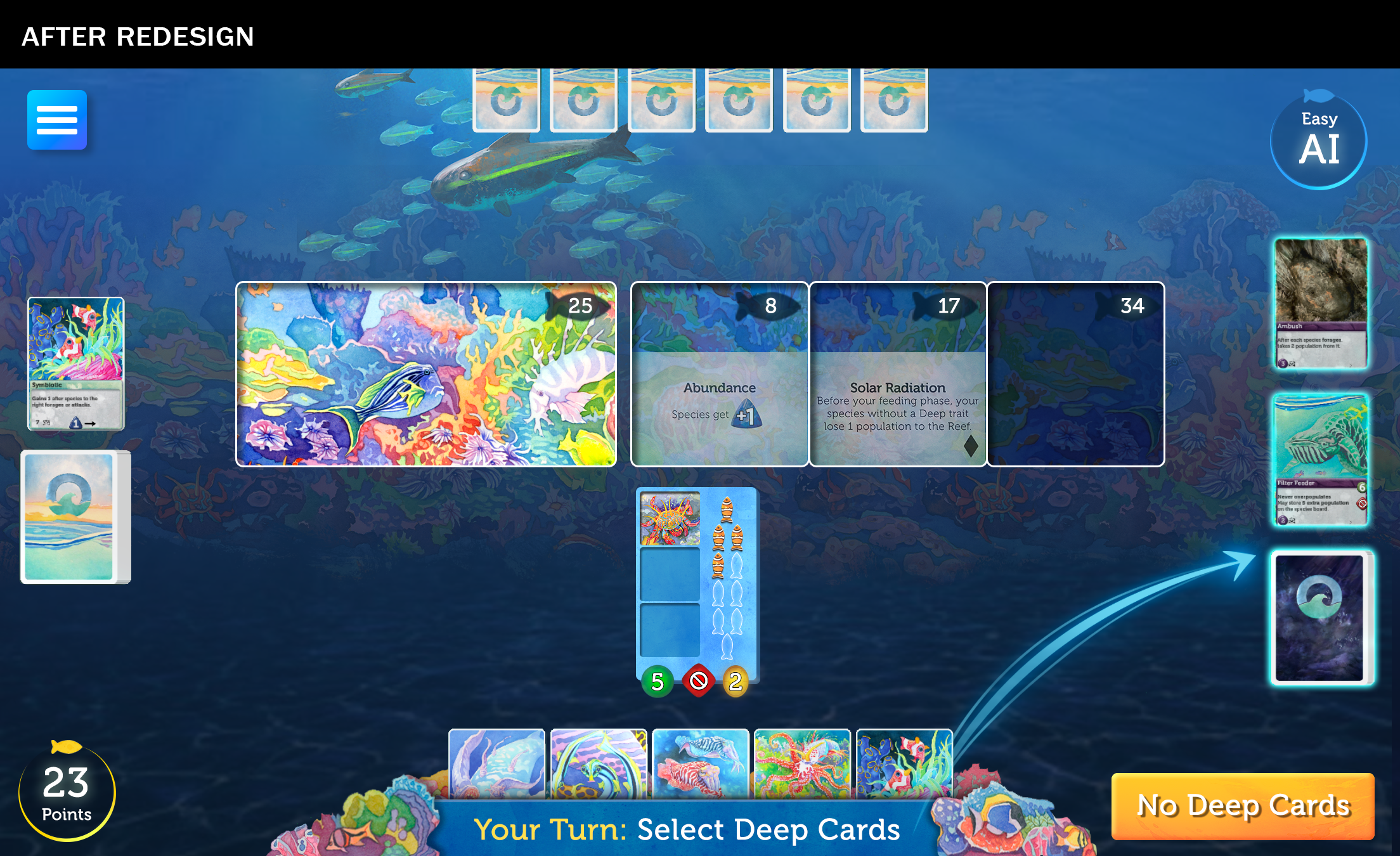
Improvements made to the original design:
Top-down flat teal background was changed to a front-on 3D view of the ocean reef and seabed with stronger contrast and cooler oceanic colors.
Center reef boxes were simplified, including how points are displayed.
Buttons, Card Pocket, Drag Arrow, and Player Name / Points were given a more contemporary design.
Call to action (player instruction) text was moved onto the status bar with “Your Turn”.
Loading Screen Redesign
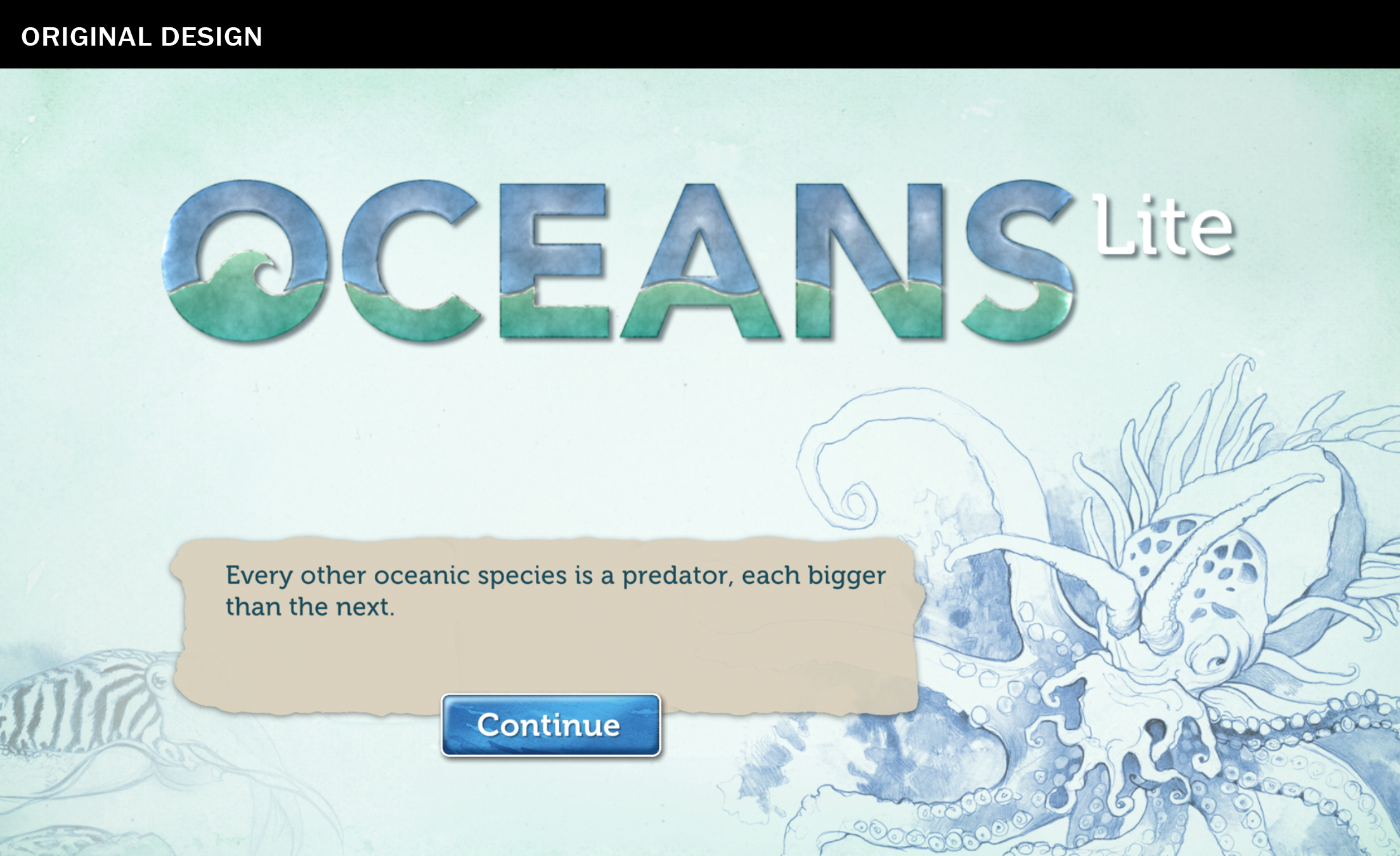
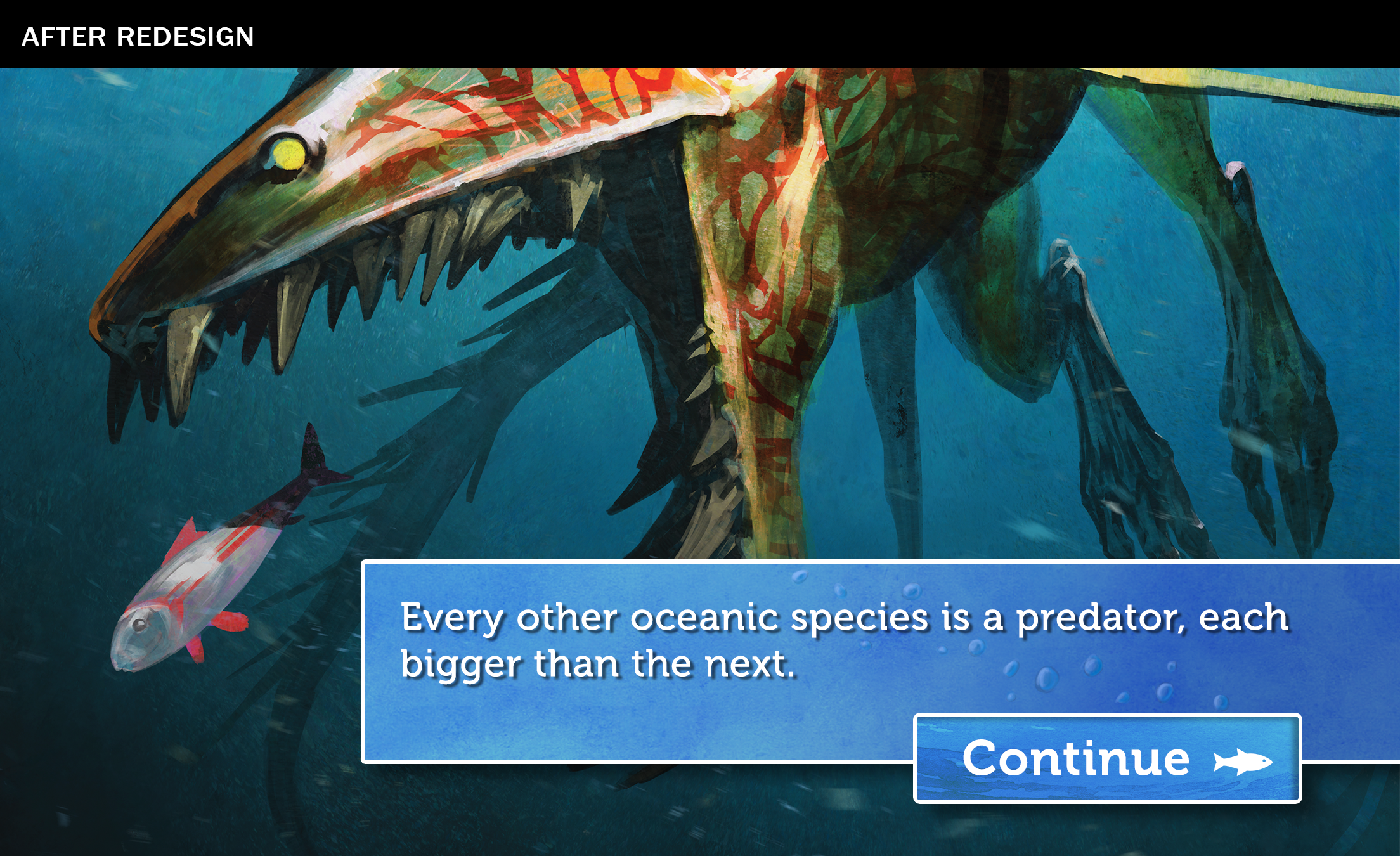
The original design for the loading screen has some issues and could be much better utilized since it will hold a user’s attention for 3-5 seconds while content loads behind it.
Too much prominence is given to the game logo, which the user already sees on the main menu screen.
Sketch art is static, and not as interesting as full color concept art.
Factoid box feels dead and lifeless.
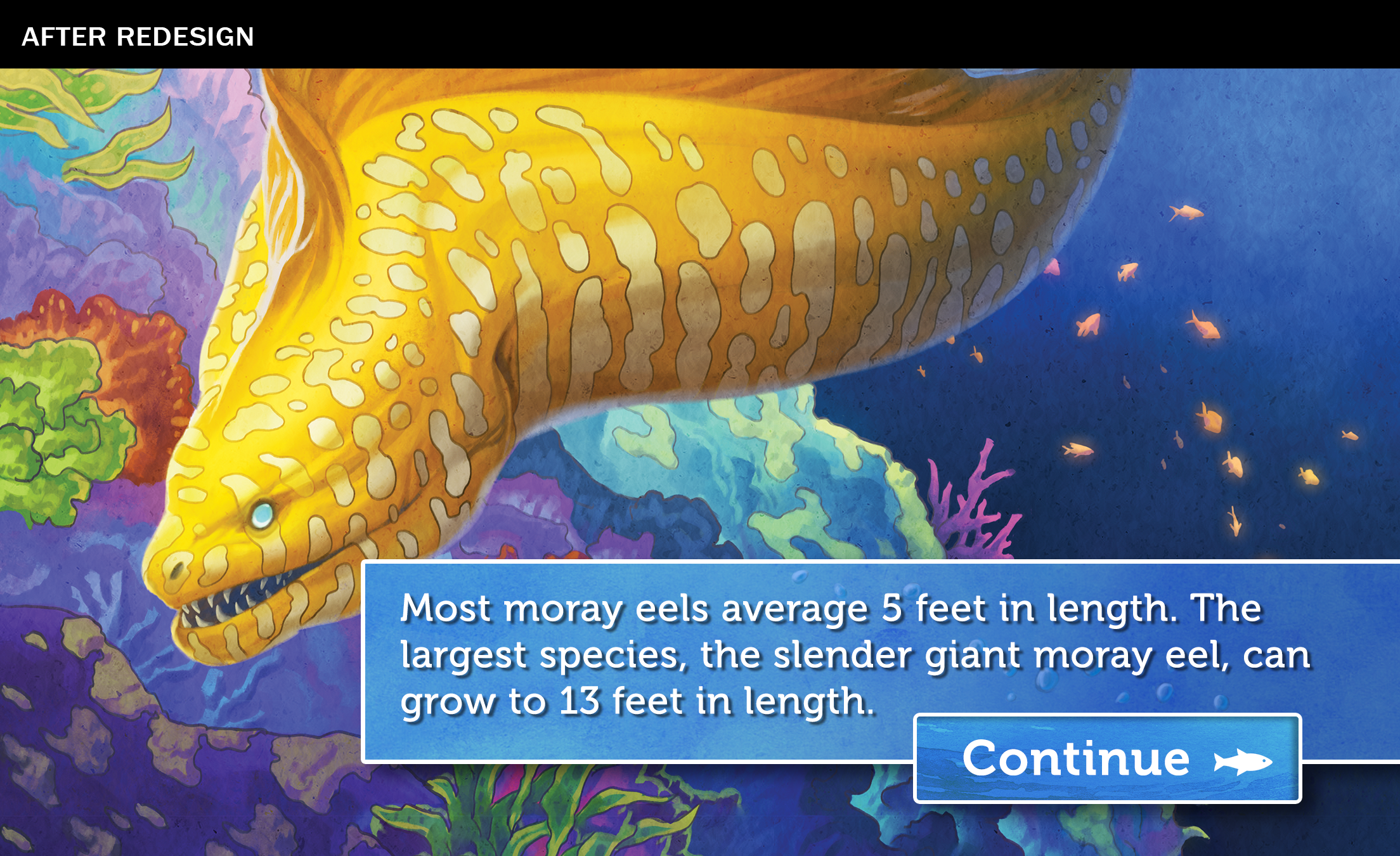
New design for the loading screen utilizes 100+ pieces of full-color concept art and rotates through with factoids, presenting a better loading experience for the user.
CTA Button and text box have been improved visually and brought in line with original board game art.
The Before and After of Evolution
Watering hole redesign [before & after]
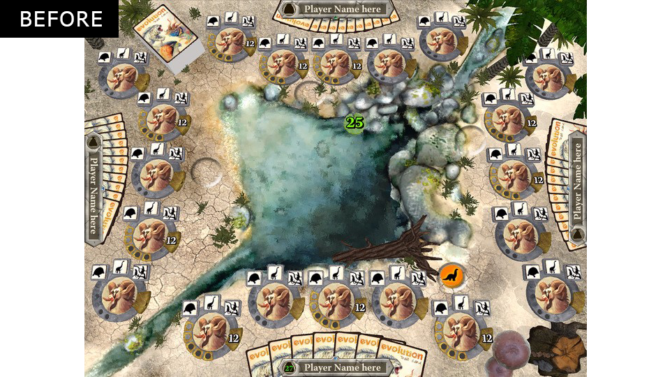
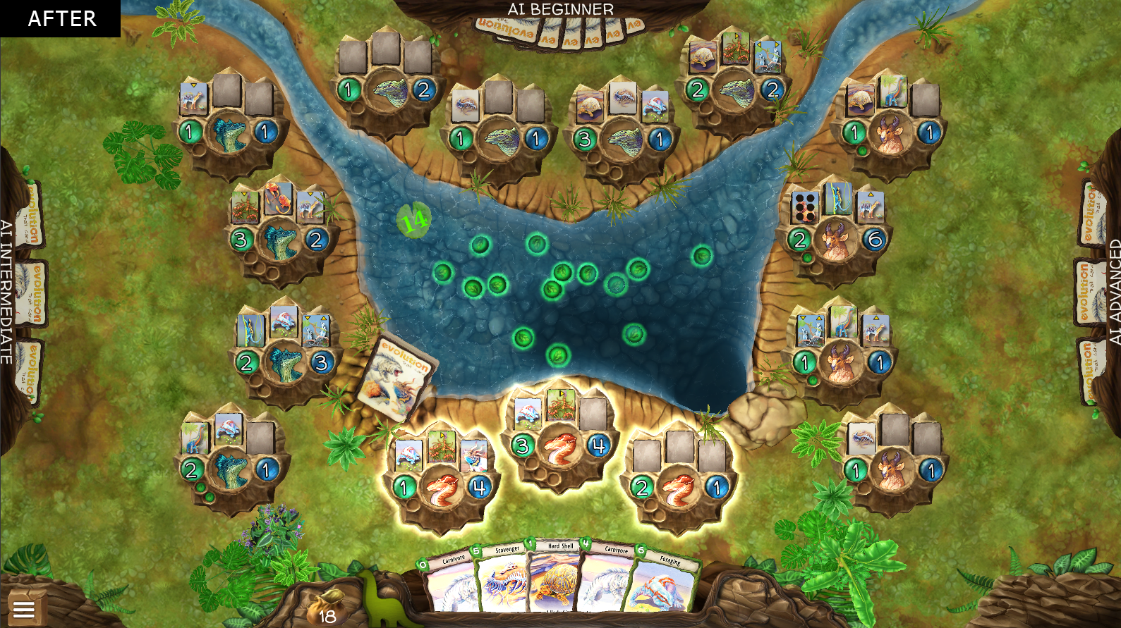
When I joined the project, the watering hole was attractive, but it was awkwardly straddling between realism and fantasy, and the mixture of photo-sourced textures and poorly tiled grass textures wasn't working with our beautiful illustrated cards and creatures. The plants left a lot to be desired, and when vegetation flourished or receded, the growth pattern didn't feel natural. The icons on the species markers were black and white icons, which distanced themselves from the familiar card art players know and love.
I decided to push the look and feel of the environment further away from realism and photo-sourced textures, and more toward hand-painted, to draw on the watercolor art in the original game cards. Due to our platform requirements, we were never going to be able to get the game environment to be hyper realistic and for this type of game adaptation - a strategy card game - I felt that realism would be a visual distraction. In the "After" slide, the detail in the environment is simplified, and suddenly all the on-screen elements, like the species markers, cards, and icons, are at the forefront of the experience.
SPECIES MARKER REDESIGN [before & after]
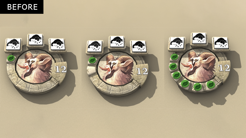
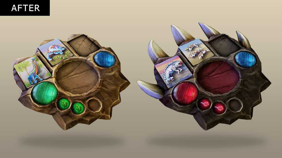
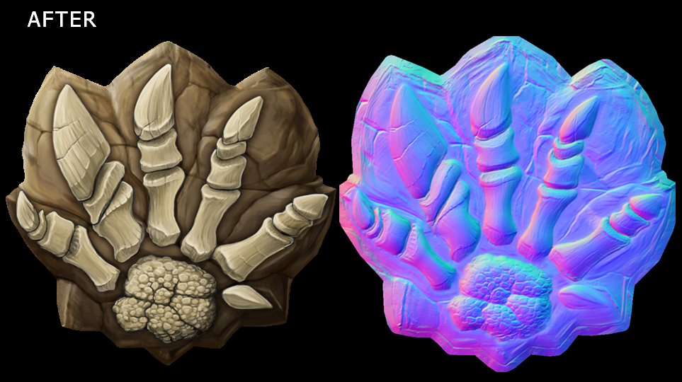
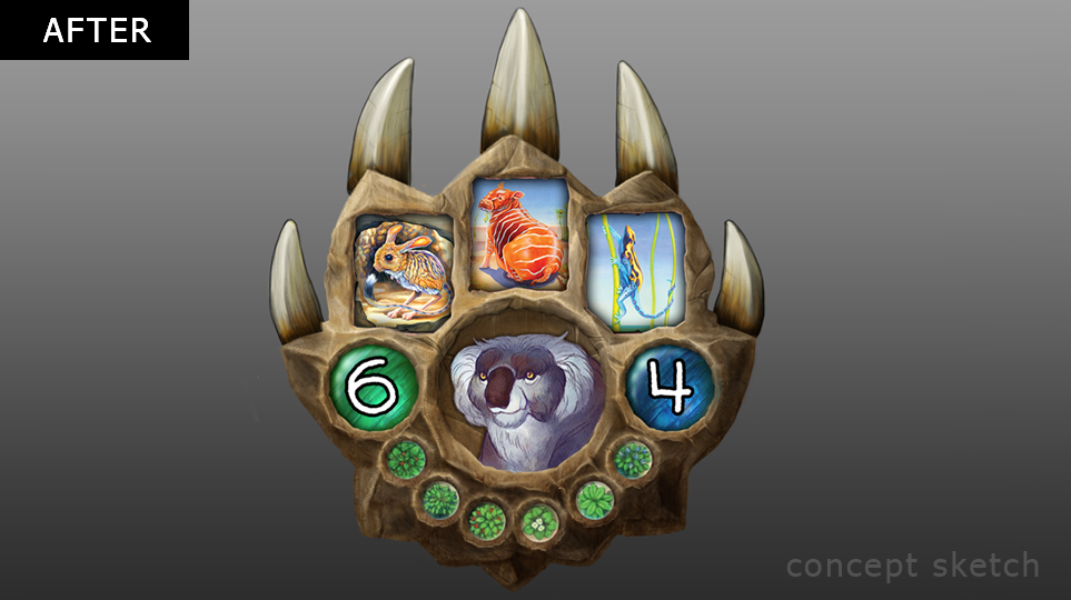
The species badge posed a particular challenge because we needed to represent a number of attributes and information: three trait cards, body size, population, avatar, and food eaten. In the Before design, the species marker felt flat, flimsy, like a token from a roman-style board game, and not like a part of a natural environment, even though it technically existed in world space.
Working with the concept of a fossil 'footprint', I redesigned the species marker to be more organic and 3D, to both better fit with the environment, feel less flimsy and more substantial, and to allow for cool effects like the footprint rock crumbling away to reveal a fossil inside during the extinction phase of the game.
Cards Redesign [Before & After]
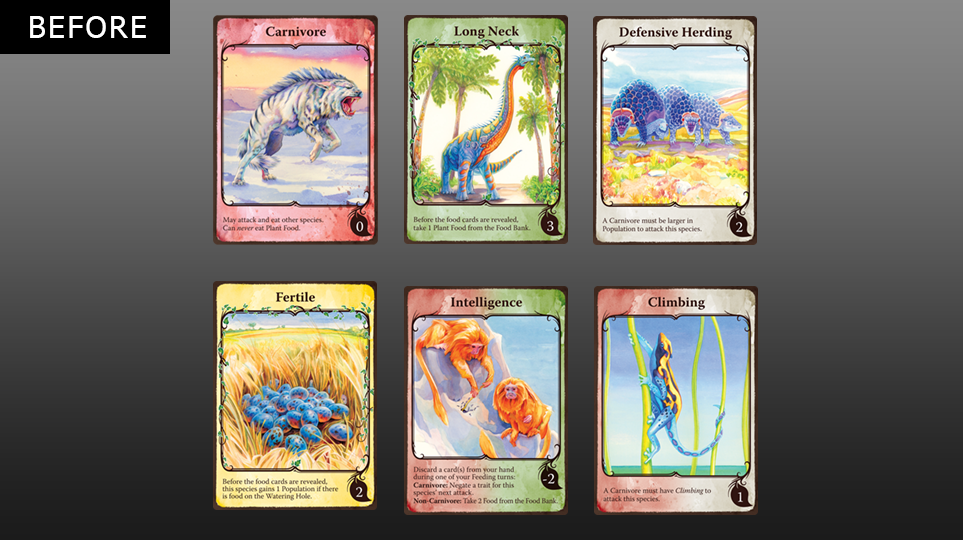
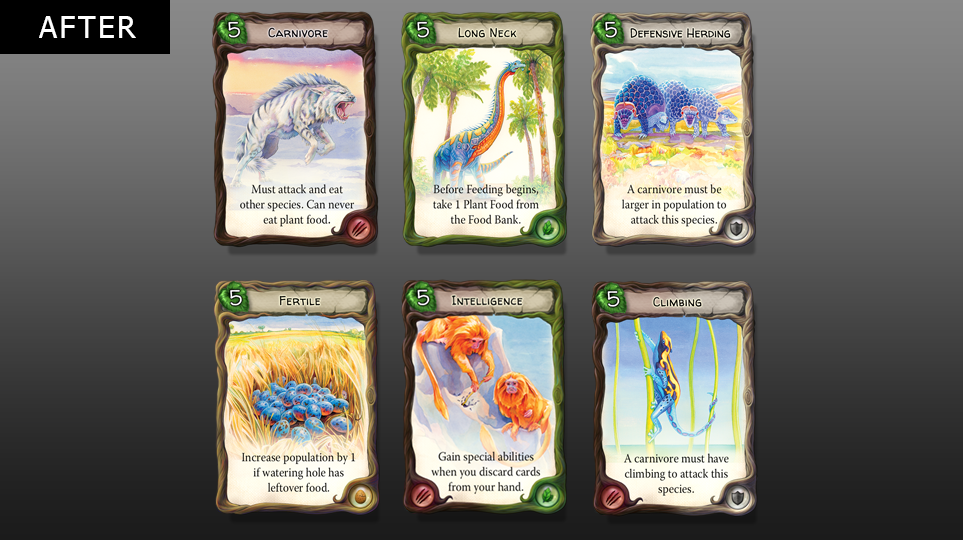
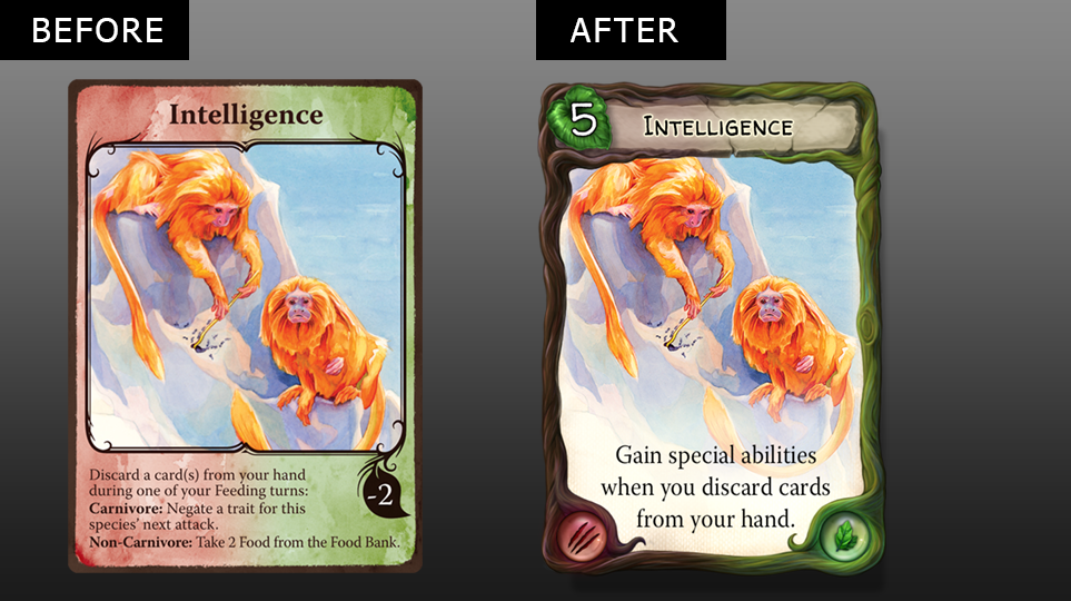
Initially, I was hesitant to make any changes to the cards. After all, Evolution as a tabletop game was a success and we know our players are very attached to the art. Nevertheless, I felt that somehow the card styling just didn't fit the look of our game; the borders were very outdated and tired looking, the serif fonts didn't match the fresh new styling in our game, and the food value number (on the little leaf) was getting completely lost in the fan of cards being placed at the bottom. The categories of cards (defense, carnivore, unique, and herbivore) were denoted by a subtle change in background color on the card, but this was often unnoticed and didn't help the colorblind at all.
I felt that we could keep the integrity of the original watercolor art, but freshen up the card's look entirely with a bold new painted border, a 3D mesh food value leaf positioned in a much more user friendly location, and new fonts that were much more legible. In addition, the color-coded categories now use an icon (slash for carnivore, shield for defense, leaf for herbivore, and DNA helix for unique) in addition to the traditional color. The result, I feel, is a much more modern take on Evolution's cards without departing too far from what won people over, and a usability improvement for the visually impaired.

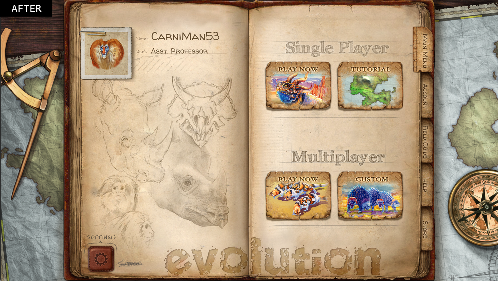
Main Menu [Before & After]
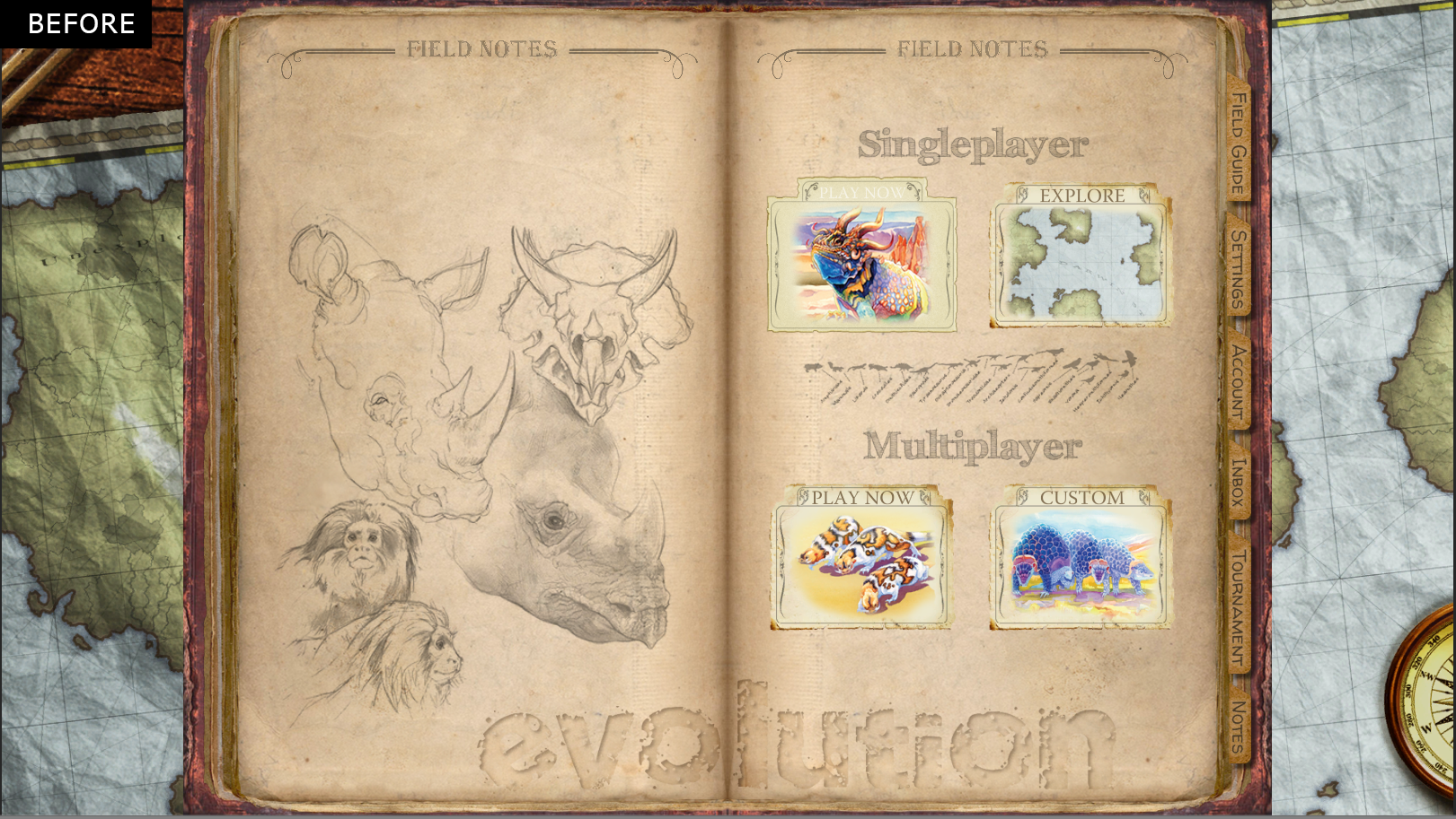
With the Main Menu, the style was evocative of an early explorer handbook, weathered leather, old navigation tools, field sketches, and parchment. The style however felt very flat and lifeless. The calls to action weren't clear enough and I struggled to read the text options on all of the clickable buttons.
When redesigning, I chose to keep with the early explorer theme, alpha testers really loved it. I also really liked how it tied in with Darwin and Evolution elements that carry throughout the game. I chose to bump up the contrast, reillustrate the entire book section, tabs, pages, buttons and background elements like the protractor and compass. Pushing the values, brightening the colors, and updating the fonts help to make everything pop and feel more like a 3D desk scene.